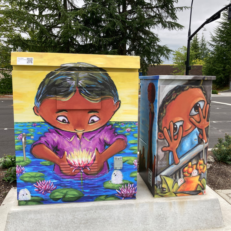
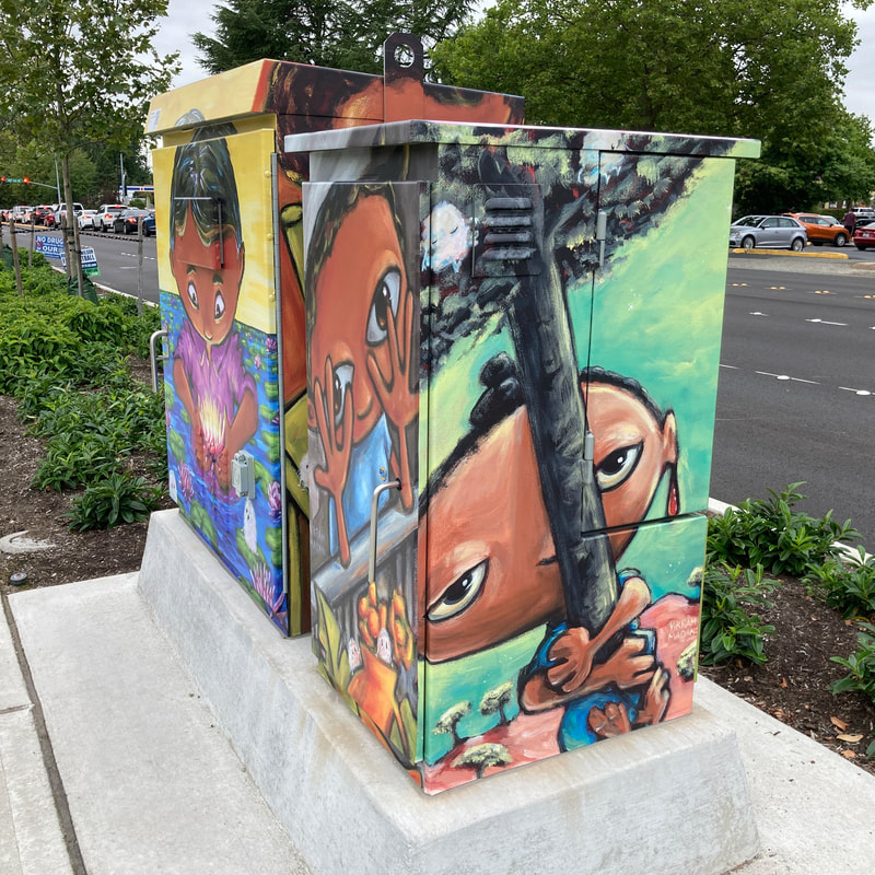
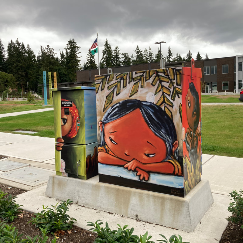
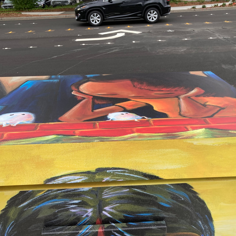
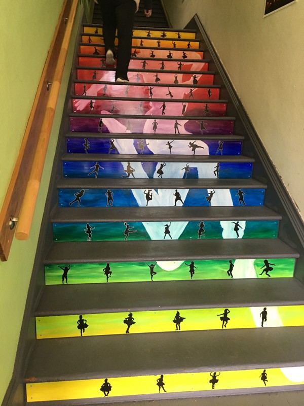
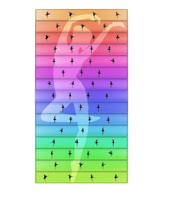
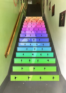
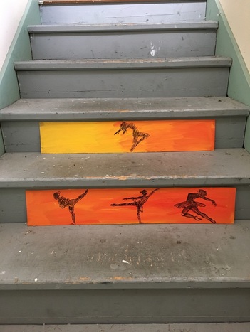
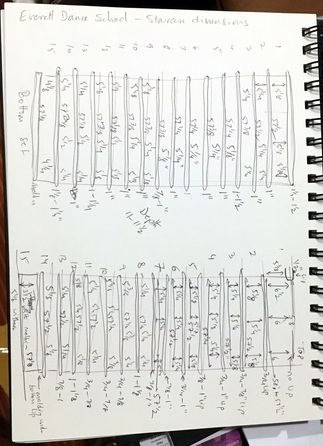
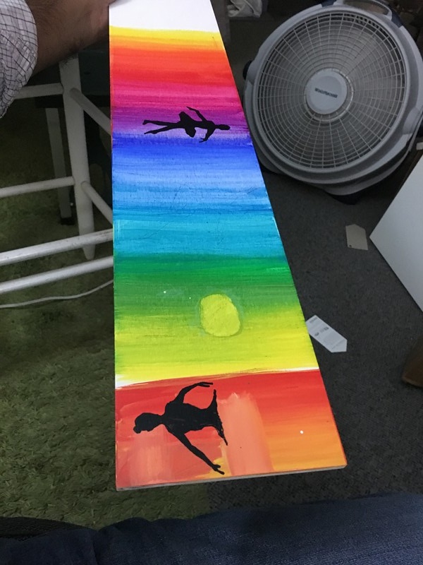
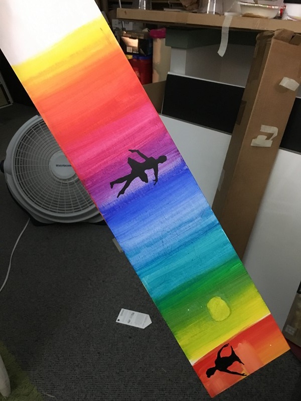
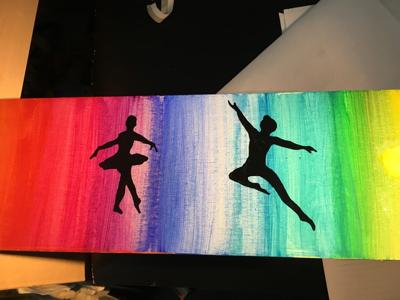
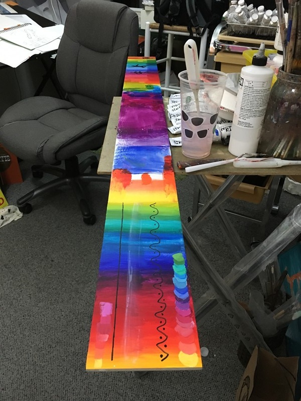
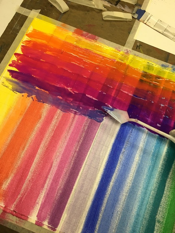
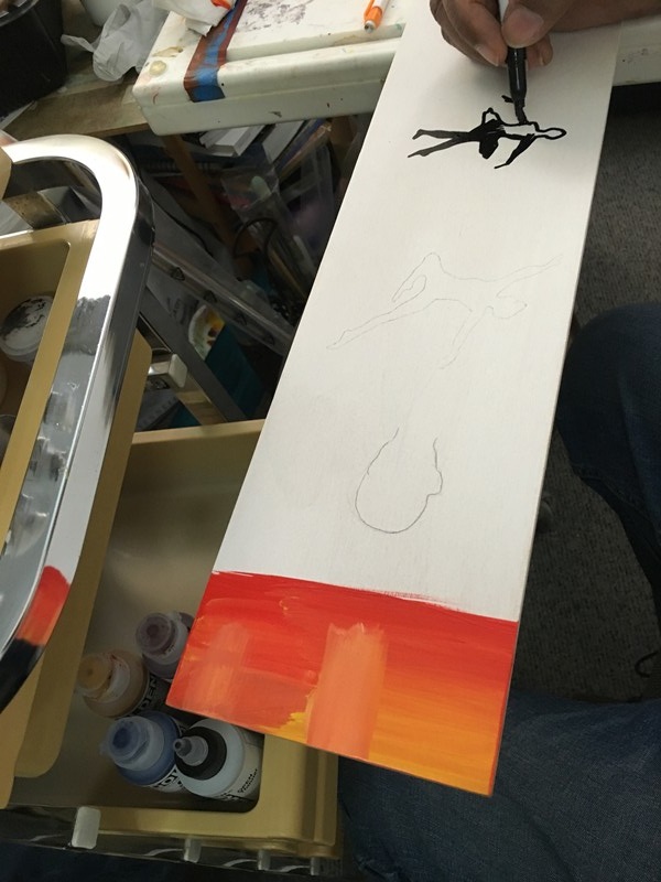
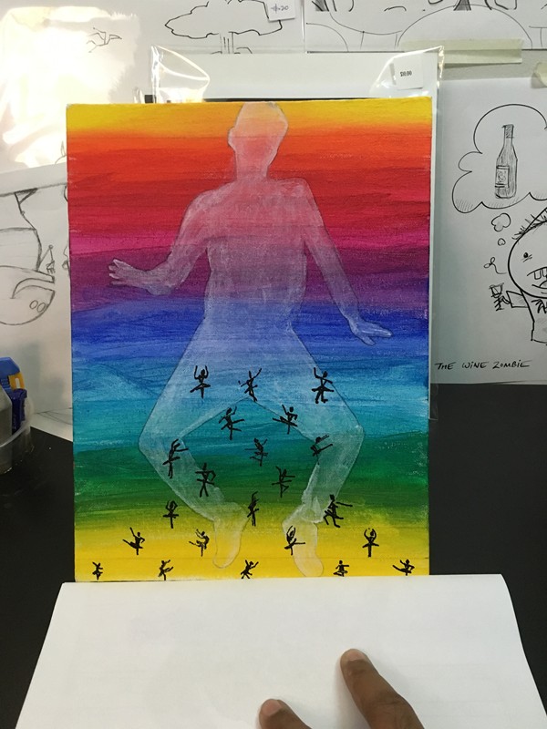
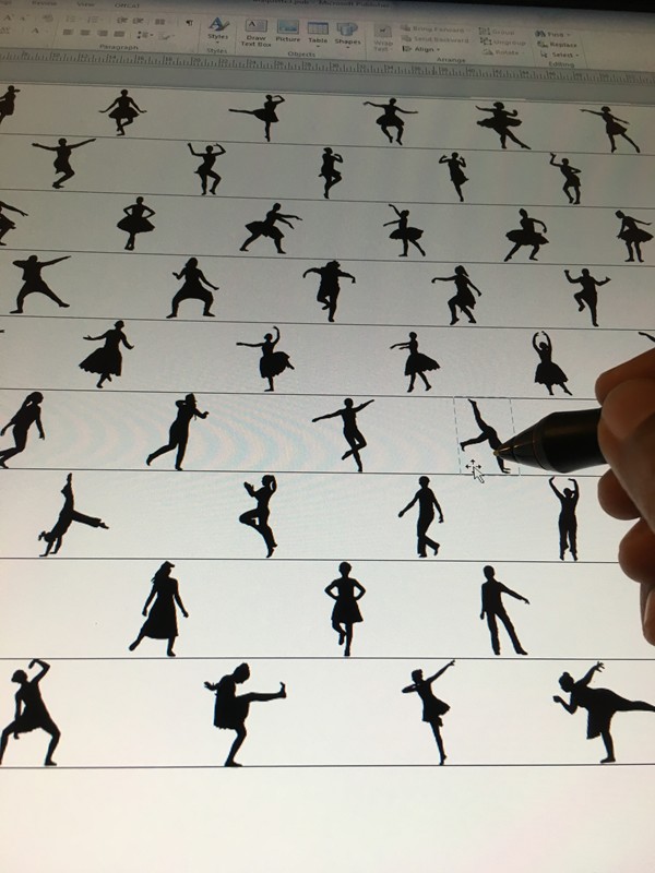
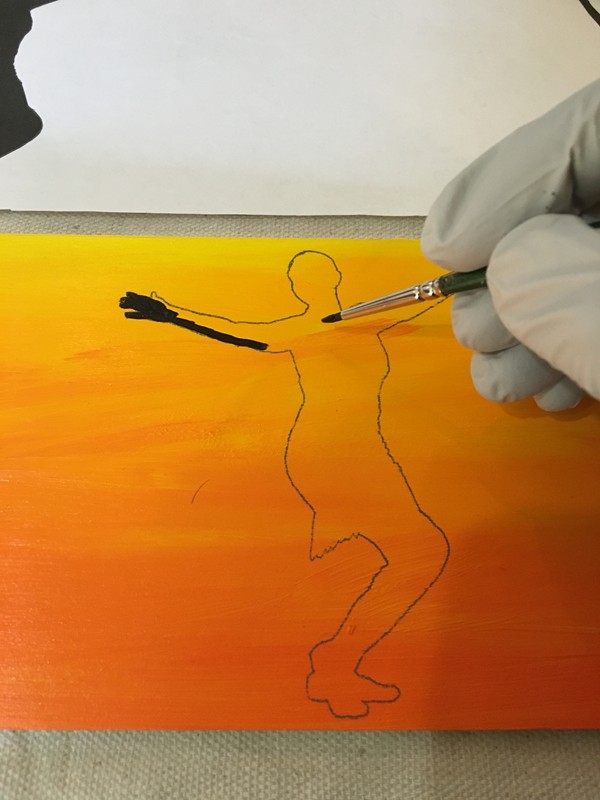
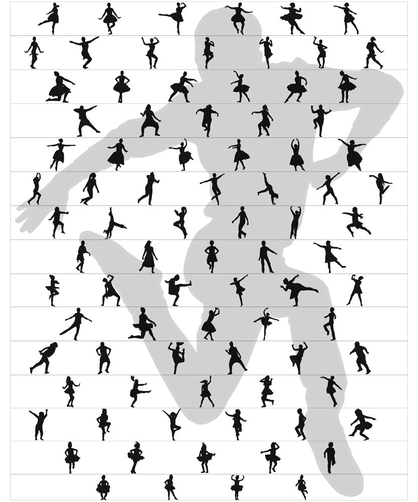
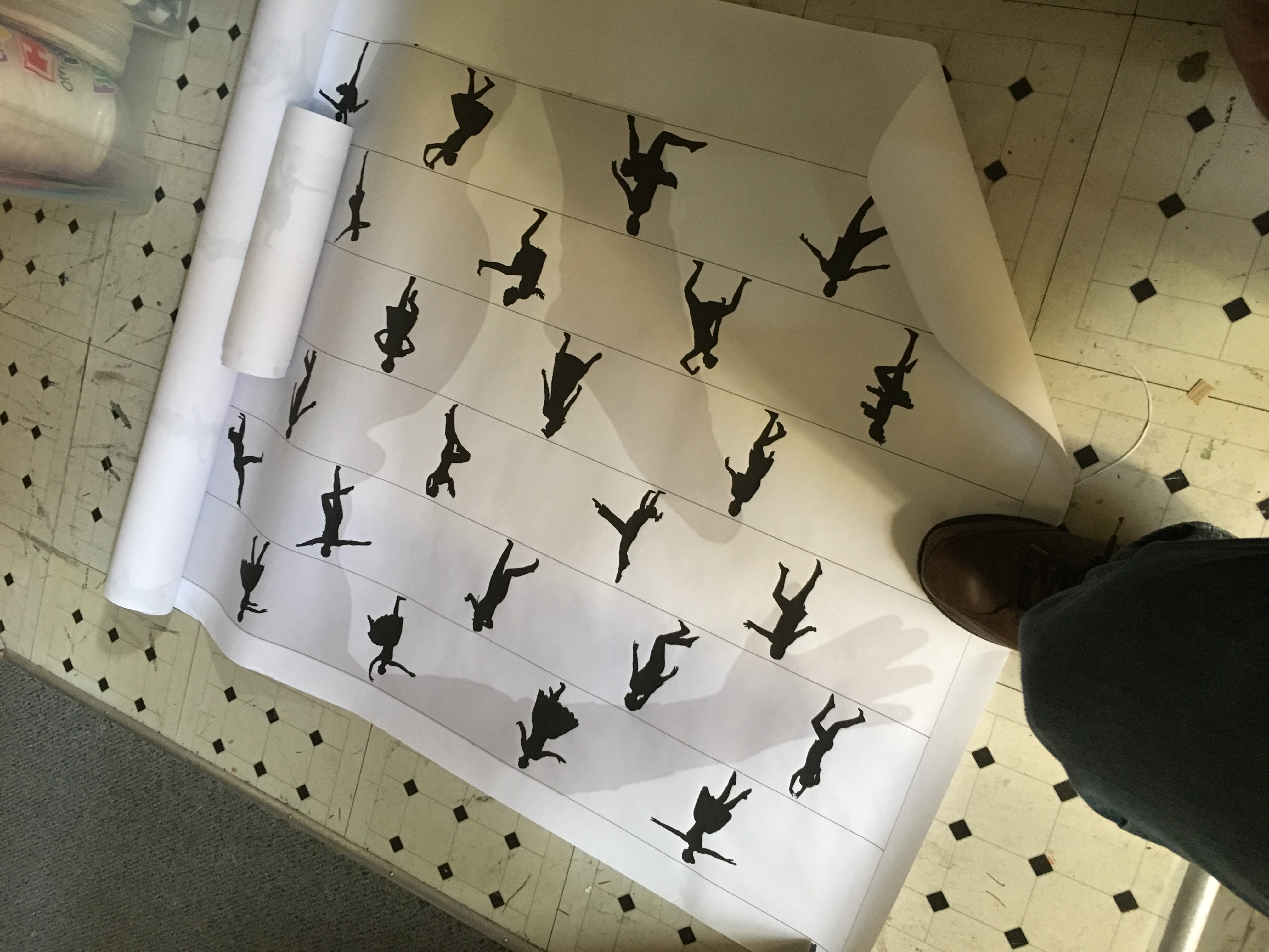
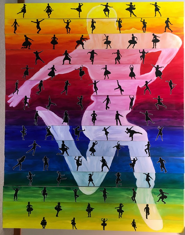
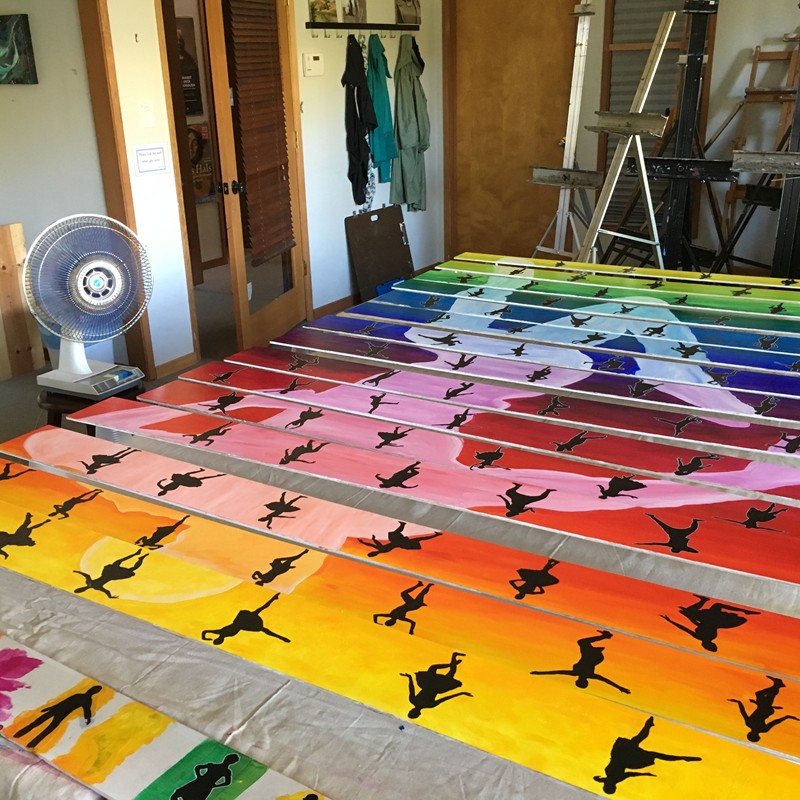
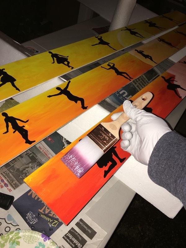
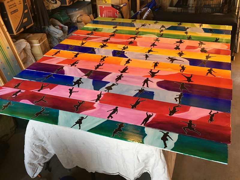
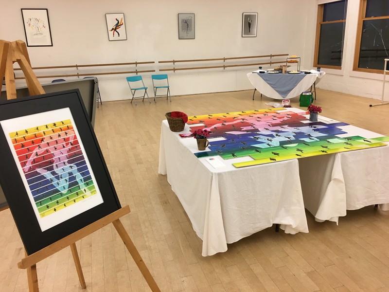
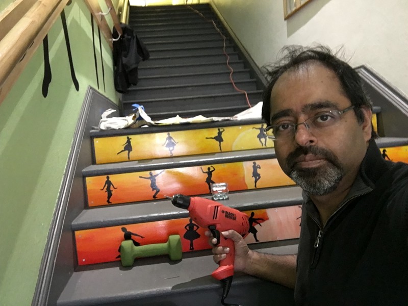
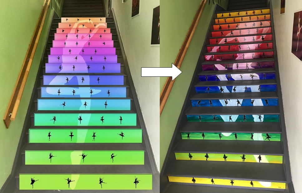
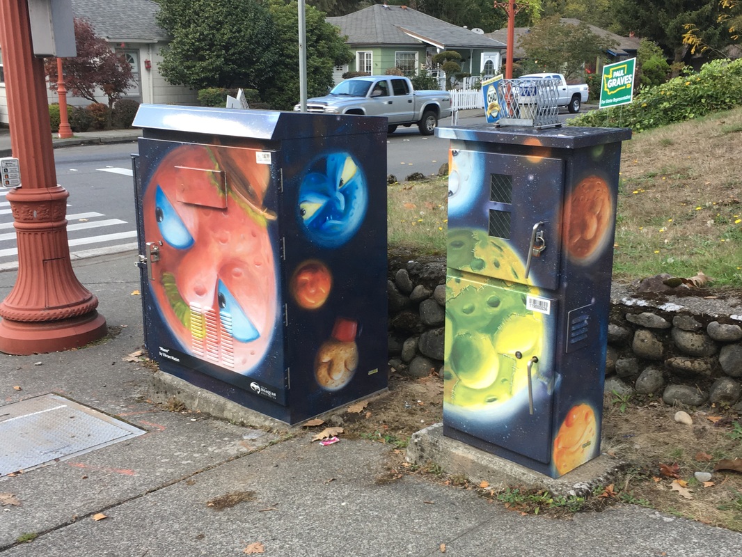
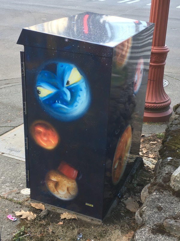
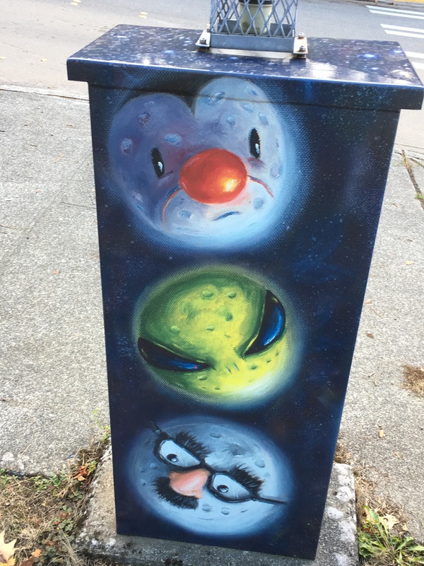
At 23 feet high and 56 feet long, my new Mural at the Odessa Brown Children's Clinic in Seattle WA is my largest mural to date. The mural is installed in a stairwell with the intention of getting more kids to take the stairs. Read all about this mural here.
2 Comments
I am delighted to showcase my art publicly in my home city of Bellevue WA, this time on a utility box located in front of Highland Middle School. This particular installation features 10 images from my series AN UTTERANCE INEFFABLE.
Locals, check it out when you are driving by on Bel-Red Road, Bellevue WA. A recently unveiled Utility Box Mural in Kent, WA featuring art from my Perplexed Penguins Oil Paintings.
Located at the intersection of SE 272nd St (Kent-Kangley Road) and 152nd Ave SE in Kent WA. The City of Renton WA invited me to participate in their 'Dragon Days' celebrations by creating a public art display in a vacant storefront. I decided to highlight some of the dragon art and poems from my book A Hatful of Dragons and created a large sized display 5' high and about 80' long featuring both poetry and art. This video shows it best: The drawings in my book are pretty small, just a few inches max, so I had to redraw the drawings and then add color. These were then sent to a sign printer and printed out as large size window clings, which I then manually installed for the display. Putting up these clings was harder than it looks - not for the faint hearted!
I spent 7 months in 2019 working on the a 'Spirit Animals' mural for Stevenson Elementary in Bellevue WA. Each of the 80 animals on this mural was designed by a kid.
Click here to read more about this project, see a making-of video, and look closer at all the creature art.
Many thanks to the City of Burien for installing a Utility Box Mural based on one of my paintings 'Contemplation, in Yellow' featuring a meditative self-reflective coffee-drinking elephant. I mean, why not? :) This public art is located at the corner of 122nd and Ambaum in Burien WA. The City of Kent recently commissioned me to create a utility-box mural as part of a City Art Project to beautify the city and also reduce graffiti. The utility-box mural is located on the Interurban trail near the South Kent Park and Ride. Here is what it looked like before this project: And here is what it looks like now, so yes, beautification projects like this really work :) : Some of you may recognize this design. It is based off my oil painting 'The Great Escape' from 2017:
This is the behind-the-scenes story for "Dancing with the Stairs" - a 'staircase mural' I recently completed for The Dance School in Everett WA. First the finished piece: Each dancer silhouette on the mural is an actual student of the school, starting from the youngest at the bottom to the most proficient at the top (representing the student journey), while each step features a different dance class/style. The larger figure spanning (and unifying) the steps is an instructor at the school. What does it take to create a project like this? I'm glad you asked! It starts with a call issued by the Dance School, requesting art proposals to brighten up the entrance staircase at the school, with a request that the 15-step art be cohesive, yet each step stand individually so the school could raise funds by finding sponsors for each individual step. The art further had to express a strong connection to the school. After visiting the site and taking photos, I sent in the following proposal, mocked up with clip-art: Somewhat to my surprise, the proposal beat out all the competition and I was awarded the commission. Uh-oh. Had I just proposed painting an entire staircase full of little silhouettes of actual people that were going to be about 5 inches high? Was this design even going to work? When in doubt, create a prototype! I cut up some cardboard, added some color and traced some photos from the web using a sharpie, and tested these 'dummy' panels on my studio stairs. And what do you know, it seemed to work well. 5 inches is plenty high to capture a full figure in detail. Whew, what a relief! For the project I would need custom art panels cut to fit the stairs. Back to the site for a round of careful measurements, through which process I made the unpleasant discovery that the height, width, and depth of every single step was different. I found a local source for custom-made artist panels who recommended using 1/2 inch thick panels for each step a anything thinner could potentially warp during the painting process. However adding a 1/2 inch panel reduces the stair depth by 1/2 inch. Would that create a potential safety hazard? Possibly. Next thing I know I am digging up building codes to understand just how much leeway I had for reducing the tread depth safely. Turns out not a lot, just 1/4 inches. (BTW When I decided to embrace art, I never imagined reading building codes would be part of that equation!) I decided I had no choice but to accept the risk of using 1/4 inch panels and having them warp! The blank panels arrived, and then another site visit to make sure each panel fit it's intended location. (The last thing I wanted was to paint a panel and then find it wouldn't fit). Thankfully there were no issues with panel sizes and fits - the panel creator did a great job following my specifications. Not having painted on these kinds of panels before, I knew I needed to experiment to ensure the panel + paint combination would behave as expected. I therefore made sure to order a few extras that I could 'play' with. What followed was a few straight weeks of experimentation with many different paints, fluids, gels, finishes and application methods to see what would work best for this project: In the end I concluded, what would work best was to simply paint as I always do, using heavy body acrylic paints. To minimize potential warping of the panels, I then took the extra precaution of coating the back of each panel with an acrylic polymer that hardens into a stiff layer. Stiffer panels should be less likely to warp (or so the theory goes). The painting process was divided into two stages: Stage 1: Paint a 'rainbow' background on all the steps, along with the central figure. Stage 2: Paint silhouettes of individual students Would a rainbow spectrum actually work? Would some of the background colors be too dark? Too light? Could I control the gradations? Would silhouettes be visible against the changing background? Time to do another test, this time creating a 9"x12" maquette (i.e. scale model): The color gradations seemed to work. However after doing this maquette I decided the background figure wasn't looking 'dancer-ly' enough, and which led to a detour to find another, more dynamic photo, which took another few weeks to resolve. Lesson: always make a scale-model folks - you'll be surprised what you learn. (Yes it's the same person in both photos - Sam Picart, one of the school's instructors. Both silhouettes are traced from photos. First image (left) based on a photo from the Everett Herald, photographer unknown. Second image (right) based on a photo taken by Joe Lambert). Once I had a background photo that worked, it was time to paint in the background colors into the panels. Here's a time-lapse video showing that process: Next came the dancer sihouettes. I had originally proposed photographing the dance students myself. However turned out the school had just had their Year-End-Performance professionally photographed and were happy to let me sift through the existing photographs. The only problem? There were over 6000 photographs I would need to sift through! Why would I need to sift through all 6000+ photos? Because not every photo or pose turns into a successful silhouette. The shape of the sihouette has to clearly convey the dancer's motion, intent, and dance-style and most photo angles just dont work. I was also keen to tap into the diversity of the school's students (genders, ethnicities, body-types, etc) and this required going through all the photos with an eagle eye. A couple of sifting days later, I had a set that would work. The next step was to convert each dancer into a sihouette. Easier said than done! For the next couple of days, I sat on my workstation, painfully tracing the outline of each dancer and then converting the shape into a silhouette. Let's just say I am not keen to repeat this part of the project - like, ever! Once I had my silhouettes, I needed to design the actual staircase mural to scale. For this, I recruited Microsoft Publisher, creating a 5'x6' document and inserting and placing all 80(!) silhouettes in it. (If you're paying close attention, you'll see the diversity, and also the fact that each row in the image above represents a different dance style). To go from computer silhouette to painted panel, I would need to print the silhouettes at real size, then trace them onto the panels one by one, and then paint each silhouette figure carefully. Very, very carefully! To print out my design at full scale, I went to a place with large-sized printers: Kinko's. Well, a couple of Kinko's. Each of whom kept messing up the printing. It took many iterations to get my designs printed. Oh Kinko's, that's 4 hours of my life I'm never getting back! Designs in hand, I could now proceed with painting each panel. This is what it looks like, speeded up: 15 panels later: Notice some of the panels are slightly raised? That's warping in action for you. Thankfully this can be easily fixed at install time. Here's a quick closeup of the dancer silhouettes. Quick, can you count them all? Once the panels are painted, the paint needs to be protected from the environment - and since these are staircase risers, from contact with shoes. The first step of the process was to seal in the paint with two layers of transparent acrylic paint polymer (it's basically paint without any pigment - so it behaves just like paint and binds to the underlying paint very well), followed by three coats of anti-scuff coating for a total of 5 protective layers between the paint and the errant shoe. The panels were now in a ready state. For the fund-raising activities related to the project, I proposed creating a signed limited-edition poster of the finished mural to be presented to each donor who sponsored a step as a commemorative token of their sponsorship. This required having the panels professionally photographed, which would be challenging given their size and shape, a challenge met in spades by Bellevue Fine Art, my favorite go-to fine-art scanning company. Once I had the professional scans in hand, I created the following poster: With poster and panels ready, we did a formal unveiling at the school: And then finally, it was time to install the mural: There you have it - from proposal to installed mural - a 6 month journey! To follow along with my public art projects in real time, I invite you to 'LIKE' my Facebook Art Page or follow me on Instagram @ArtByVikram,
Down by the corner, over by the pool: And that my friend, is my own creation staring back at me from the corner of Front St. and Grant (near the entrance of the Julius Boehm pool) in Issaquah Washington. It's a Utility Box Wrap, based on my painting "Night of the Mystic Moons", licensed by the City of Issaquah as a temporary public art installation. Just for reference, here is the original Oil painting;
Art Interruptions is an annual public-art program, run by the City of Seattle's Office of Arts and Culture, for purposes of vitalizing selected Seattle neighborhoods with temporary Art Installations that create discovery and surprise. I had the good fortune to be one of 7 artists selected in 2016 to activate the Rainier Valley East-West Neighborhood Greenway, which is a pedestrian path that runs through a neighborhood, connecting parks at each end.
My contribution to this project is a series of mini-murals tucked away behind street signs. When approached from one side, these look like ordinary signs, but peek behind them, and here's what you'll find: Was that fun? Yes it was! :) How did this project come about? The City of Seattle maintains (and periodically updates) artist rosters, and when opportunities like these come around, artists can apply to the projects with specific proposals. (In business jargon, it's an 'RFP'). The proposals are reviewed by an panel of jurors comprising of citizens, artists, and city officials, and artists are selected based on the match between the proposal and the site/audience requirements. My original proposal for this project was to traverse the neighborhood and create surprise/discovery by painting whimsical little vignettes on various surfaces (corners, sidewalks, rocks, poles, utility boxes) etc. The panel loved the idea, and I was selected as a project artist, only to discover that actual painting on public and private surfaces was a no-no (too permanent, invites graffiti, has site permission issues, etc). After much discussion, we concluded I should create temporary art primarily on Seattle Department of Transportation (SDOT)-controlled surfaces - in this case neighborhood street signs. (And only particular kinds of signs that would not distract from pedestrian or traffic safety - e.g. no Stop signs, or School Crosswalk signs). The process involved: * Identifying the most appropriate signs * Finding a way to exactly measure the signs * Creating designs that, as far as possible, took advantage of sign location, shape, or other attributes * Finding a way to economically create 20+ designs * Finding a medium on which to render the designs so they could be temporarily attached and eventually removed * Overseeing the fabrication * Painstakingly trimming each design to fit it's intended site (ever notice those rounded corners on street signs?) * Finally, site installation - every one of these signs is 10 feet high! Here are some process photos: For this project, I realized I would have to design everything digitally. (If I painted with real paints, I would have to scan the paintings before they could be printed on adhesive vinyl. By painting digitally, I could skip the scanning step altogether and save lots of time in the process). The above images show two designs in progress, hand-drawn on a computer. (The one on the left is Escher-inspired - Escher makes it look easy, but, trust me, repeating patterns are HARD!). Even with digital designs (hooray for UNDO), I did twenty designs taking about 4-6 hours each (=80-120 hours), meaning I was sitting in front of a computer for almost 3 full 40-hour work weeks. (Don't let anyone tell you artists don't work hard! :) ). ![]() This one gave me the most trouble! Honestly, you haven't lived, till you're perched 10 feet high on a ladder, holding a large sheet of sticky vinyl, while the WIND IS BLOWING HARD. This was the largest piece and it kept sticking to itself and to the sign in odd ways due to the wind. I had to rip it off and put it back on many, many times. Took almost 2 hours. (Notice all those uneven areas? Now you know why) Overall, this was an intense, but fun project. The art will be up Sept - end Dec 2016 so go see it anytime. More details on the City Website. Many thanks to the Seattle Office of Arts and Culture and the Seattle Department of Transportation 1% for Art Funds for making this project happen. Click below to see more details. ![]() If you made it this far, maybe you'd like to get a copy of this special Dragon print based on one of the Mini-Mural designs...? "Ombrophobia (Fear of Rain)" https://www.etsy.com/listing/466524174/ombrophobia-fear-of-rain-fun-dragon Available in 3 different ready-to-frame sizes. "Eye-Guy from Outer Space" is the second art piano I have created this summer, this one as part of Seattle's Pianos in the Parks program. Eye-Guy will be stationed at the north end of Downtown Bellevue Park (nearest Bellevue Square Mall) through Aug 13th at which time it will be auctioned off (for a good cause) to the highest bidder. Make sure to check it out if you are in downtown Bellevue. (P.S. Here's a link to my other Summer Piano) Here's the behind-the-scenes story: Meet Mr. Tubehead: Mr. Tubehead is a temporary art installation I recently created, as one of 6 selected artists, for the City of Auburn's Pianos on Parade annual summer art program. Mr. Tubehead invites viewers to "let their hair down (or up!), get goofy, and have lots of musical summer fun". The inspiration for Mr. Tubehead started with a visit at the local hardware store. While wandering through the plumbing section (don't ask), I came across PVC pipe elbows (for the record, they are sewer pipes) and I loved the smoothness and curvature of the material, and the fact that certain types of elbows slot firmly into other elbows, much like building blocks, and can thus be used to create solid wavy shapes. This fact was filed away in the back of my head, and when I came across the opportunity to create an art-piano for the City of Auburn, I knew right away that: 1. I wanted to use the PVC sewer pipes in some way 2. I wanted to create a goofy looking piano to capture the spirit of goofy summer fun that the pianos are supposed to bring to their immediate environments. Similar to the Robot Piano I created in Summer 2014, I decided this too would be an anthropomorphized creation, but this time I went back to my earliest cartooning roots, and decided to turn the piano into a black and white cartoon figure with the PVC pipes for hair. Hence the name, Mr. Tubehead. Mr. Tubehead will be on display at 144 E Main Street, Auburn WA till Aug 10th 2015. If you are in the vicinity, be sure to check it out! And now, here are some behind the scenes photos of the making of Mr. Tubehead: I was recently honored to be selected by the Spaceworks Tacoma program to create a mural at one of their rotating mural sites in downtown Tacoma. The finished mural is titled "CELEBRATION" and features 80 feet of Dancing Robots! Why 'Dancing Robots' you ask? Because, for me, this idea embodies - and celebrates ! - three things that make us, as a species, quintessentially human: First: Our universal love for music and dance Second: Our insatiable thirst to learn, discover, build, create (which leads us to build things like robots) and Third: Our unique ability to ... smile at images like this. I mean, Dancing Robots?!? What could be more wacky! :) The dance movements I chose to depict in the mural are actually based on dance forms from a variety of different cultures, regions, and eras so they truly reflect a culturally-diverse cross-section of human dances. (Note: not obvious from the images below is the days and days of preparation this project took!!). Here's the making-of story in pictures, no words: Many, many thanks to Spaceworks Tacoma for making this project happen!
The mural will be on display for a period of ONE YEAR (May 2015 through April 2016), after which the site will be repaved to make way for the next Spaceworks Mural. Check it out if you are in Tacoma, it is located close to the Tacoma Art Museum and Museum of Glass, on 11th between Broadway and Market.
Directions here: https://goo.gl/maps/voi34 Phase 2 of my residency project was to start tapping into the imagination of community kids and create fun creatures for my 35 foot mural painting. (See this post for details leading up to this point). Back in September we collected over 200 drawings of imaginary creatures from kids aged 1 through 14. Here is a sampling of what those drawings looked like: ![]() The process of incorporating these drawings comprised of the following steps: 1. Identify the submissions that were most suitable for the mural 2. Plan out where in the mural the various creatures would go, paying attention to overall composition and density. 3. Make localized decisions about the look and feel of each creature, trying to avoid too much replication of color, texture, or creature attributes, while maintaining the essence of each child's drawing 4. Paint the creatures. All of these are, of course, easier said than done :) To identify the best prospects, I first sorted the drawings by age. One of the first things I had noticed in the submissions was that there is a remarkable change in kid's drawing ability around age 5-6. Older kids submitted much better rendered creatures and if I focused only on the quality of the drawings, this would edge out our younger contributors. Sorting by age allowed me to first look for the best entries within each age group. Additionally I wanted to make sure to find and incorporate any themes that were popular across age groups (examples: unicorns, flying cats, girl-creatures, butterflies...). There were so many good submissions to choose from that it took me several days of sorting, grouping, weeding, winnowing, before I managed to identify the 80 strongest prospects. (I had originally planned to do less than 50, but there were so many deserving entries, I just couldn't leave them out!) The next step was to try and figure out where to put everything, with a balance between land, water and air creatures, and trying to populate the landscape evenly. For this a large printout helped: Once I had the creatures roughly laid out across the landscape, I could start painting. For each creature I first sketched out some loose doodles till I found a form that seemed 'just right': ![]() I then tried to figure out the colors based on where the creature was located in the landscape. This part is where the painting gets technical. For the overall image to read correctly, both as a landscape, and for the creatures to look like they are a part of the landscape, I have to be careful in my use of color and apply copious amounts of color theory. For example, I painted the landscape with cooler colors in the back and progressively warmer in the front to create a sense of space and depth. The colors for any particular creature have to fit the immediate local environment (otherwise it will look visually skewed). Since I am working with a limited number of light-safe colors, the color choices for any particular spot in the painting quickly become even more limited. The challenge then is to have multiple creatures next to each other without repeating the colors too obviously. Needless to say, figuring out the colors of the creatures took some concentrated thinking and planning, causing my per-creature painting-time estimate to mushroom by a factor of 4 to 6 (multiplied by about 75 creatures!!!) [[[ To see the full set of transformations of kids drawings into fun creatures, see this facebook album. ]]] But in the end, it was all fun. Here is a time-lapse video of some of the creatures being painted: ![]() Several weeks later, after all the creatures had been painted, the last step was to weatherize the painting surface by putting a few clear coats over the paint, followed by a few coats of UV-safe varnish. The varnish layer is removable and also protects the underlying layers from graffiti. (Note; Varnishes are toxic - always use protective gear) Once the varnishes have cured (which takes about a week or so), the mural is ready to install: Here is a panorama of the installed mural: Or better still, come see it in person. Click here for directions!
|
Categories
All
Archives
February 2025
|